Internal tools deserve good design too
Staff use internal tools for hours every day, often far more than customers use your public product. Designing them well is one of the most direct ways to save time and reduce errors.
Service 07
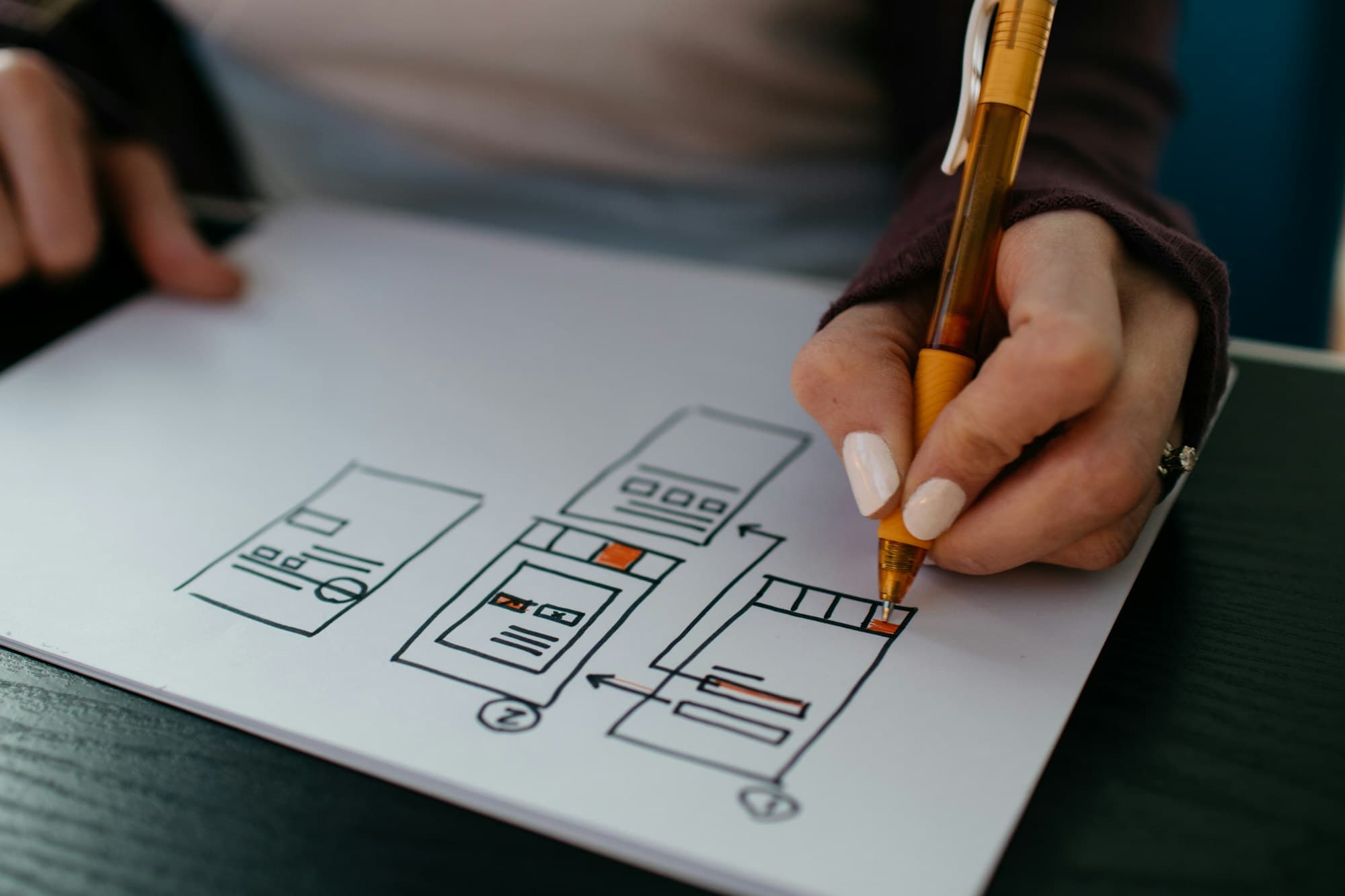
We design interfaces for web and mobile products, from early prototypes to complete design systems. Because we also build software, our designs account for real data, edge cases and technical constraints, so what you approve is what gets shipped.
Support requests, abandoned sign-ups and training sessions suggest people cannot find their way through the software on their own.
Before committing to a build, you want a clickable prototype that you can put in front of customers or investors to test the concept.
Different screens use different patterns, colours and components, making the product feel disjointed and slowing down development.
Staff use clunky admin screens all day. Small improvements to those workflows would save a noticeable amount of time across the team.
Interviews, workflow observation and analysis of existing usage to understand what people need and where they get stuck.
Clear structures for navigation, content and user flows, mapped out before any screens are designed.
Clickable prototypes for testing ideas with real users and aligning stakeholders before development begins.
Detailed, accessible screen designs covering real content, empty states, errors and loading, not just the ideal path.
Documented components, tokens and patterns shared between design and code, so the product stays consistent as it grows.
Expert review and user testing of existing products, with prioritised recommendations your team can act on.
Good design starts with understanding the work people are trying to do. We talk to users, watch them use existing tools and look at the data before sketching anything. For internal and B2B software especially, the gains come from removing steps, reducing decisions and showing the right information at the right moment, rather than visual polish alone.
We move from rough to refined deliberately. Low-fidelity flows let us test structure cheaply; clickable prototypes let users and stakeholders react to something concrete; detailed designs come only once the direction is settled. Accessibility is part of every stage, from colour contrast and type sizes to keyboard navigation and clear error messages.
Designers and engineers work together throughout, which avoids the familiar gap between what was designed and what can be built. Designs account for real data lengths, permissions and failure states, and are delivered as a component-based system that maps directly to code. All design files and assets belong to you and are organised so another team can pick them up.
Both. We can run a design-only engagement and hand over files and specifications to your developers, or build from designs your team has created. Many clients find it efficient to have design and build under one roof, but it is not a requirement.
Mainly the number of distinct user journeys and screens, how much research is needed, and whether a design system is part of the scope. Redesigning an existing product also depends on how much of the current structure can be kept. We scope design in phases so you can review direction before committing to detail.
Yes, and we scale it to the project. That might be a handful of interviews and observation sessions, testing a prototype with target users, or reviewing analytics and support tickets. Even a small amount of research tends to prevent expensive wrong turns.
We design to WCAG guidance from the outset: sufficient colour contrast, legible type, clear focus states, meaningful labels and layouts that work at different sizes. Accessibility issues are much cheaper to prevent in design than to fix in code.
Organised design files, a documented component library or design system, prototypes and any research findings. If we also build the product, the design system is implemented in code as well. Everything is yours to keep and reuse.
Staff use internal tools for hours every day, often far more than customers use your public product. Designing them well is one of the most direct ways to save time and reduce errors.
Vague briefs produce quotes that cannot be compared. A few days of structured thinking before you contact suppliers will save weeks of confusion later.
Tell us what you are trying to achieve. The first conversation is about understanding the problem — not selling you a solution.